ShopDreamUp AI ArtDreamUp

Deviation Actions


Suggested Deviants


Suggested Collections


You Might Like…


Description
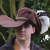
Dr. Thadius does some time traveling to RUIN on 10/30/09.
I only did some slight photo manip here (to add the glowing blue steam). Mostly this looks so cool because of the awesome photography skills of Jamais Vu.
Model: Michael Haneline (Me)
Costume Design: Michael Haneline (Me)
Photo: Jamais Vu
I only did some slight photo manip here (to add the glowing blue steam). Mostly this looks so cool because of the awesome photography skills of Jamais Vu.
Model: Michael Haneline (Me)
Costume Design: Michael Haneline (Me)
Photo: Jamais Vu
Image size
332x500px 123.45 KB
© 2009 - 2024 gadren
Comments7
Join the community to add your comment. Already a deviant? Log In
Off the bat, I do like the pose, and your costume is a good one. Not trying to sound mean, but what I like about it ends there; it's a decent picture, but three things it from being great.
1)The lighting isn't balanced. You have two different light sources coming in from two different directions, on two different levels. It's also too harsh, the source on the left is washing out your features to the point they appear blurry, while the one on the right is trained primarily on your arm casting your lower half into shadow. The light should either be soft, or diffused, and if you're going for a portrait shot I would recommend switching your light source to the front.
2)Or if, like it I think you were going for, you're trying to set a scene, I would pull all the lighting to the left, illuminating your front, casting your back into darkness. I would also allow for more negative space on the right and less on the left. Your head is centered, but your body isn't and it feels lopsided. It might sound weird phrased this way, but I would draw a line where your spine is and center from there; essentially from the front of your ear down.
3)Now, because that red is brightest, my eye goes there first and then stops. If you diffuse the light, and shifted your left shoulder a hair more towards the camera, the cord would become more visible and bring the eye back round. That cord all but disappears against your coat, maybe if you added an electric effect onto it and the time box, and of course the light bulb too, it would show better overall. And I would think about doing the same on the green bit round your head, because I almost didn't notice it, it blends in quite well with your hair. With the added effects, it will help keep your tie from leaping off the page and overpowering the other colors too (which I love that shade of green btw).
That's pretty much it, aside from suggesting you play around with background colors to see how different ones affect the feel. But that's not really a criticism, more an excuse to keep playing. <img src="e.deviantart.net/emoticons/w/w…" width="15" height="15" alt="